
K Shaped Economy Investment Checklist
Send download link to:
Recommended Course

K-Shaped Economy
May 7, 2026
What is a K-shaped Economy?
A K-shaped economy describes what happens after a recession or economic shock when different parts of the economy move in opposite directions at the same time. Some sectors, companies, and households rebound and grow, while others continue to weaken or fall further behind. The term “K-shaped” reflects this split: one side moves up, the other moves down. This is not simply an uneven recovery over time; it indicates a deeper structural divide in economic outcomes.
For financial analysts, this matters because aggregate growth data can be misleading. Strong headline indicators such as GDP, earnings, or market performance may suggest a healthy recovery, even when significant portions of the economy remain under pressure. A K-shaped recovery highlights the gap between overall economic performance and the experience of weaker sectors, industries, and income groups.
Key Learning Points
- A K-shaped economy creates winners and losers at the same time
- Headline growth can mask deep divergence across sectors, firms, and households
- COVID-19 did not create the K-shape. It exposed and accelerated structural inequalities that were already present
- For investors and bankers, K-shaped conditions shape sector performance, deal flow, portfolio positioning, and credit risk
What is a K-Shaped Recovery?
A K-shaped recovery is the post-recession phase of a K-shaped economy. It describes a rebound where gains are concentrated in some parts of the economy, while others continue to contract or lag further behind. The defining feature is not that recovery is uneven in pace, but that outcomes move in opposite directions at the same time.
This sets it apart from V-shaped, U-shaped, W-shaped, and L-shaped recoveries, where improvement is eventually more broad-based. In a K-shaped recovery, divergence persists through the rebound, reinforcing structural differences across sectors, businesses, and income groups.
Types of Economic Recovery Shapes
To fully appreciate the K-shaped recovery, it helps to understand where it sits among the broader family of recovery types:
- V-shaped: Sharp decline followed by a rapid, broad rebound
- U-shaped: Longer downturn followed by a gradual but broad recovery
- W-shaped: Recovery that is interrupted by a second decline
- L-shaped: Sharp fall followed by a long period of weak growth or stagnation
- K-shaped: Split recovery in which some sectors, firms, and households move up while others continue to fall behind
What makes the K-shape different is its divergence. It does not describe a single, shared recovery path. It describes an economy in which different groups experience fundamentally different outcomes at the same time.
The term itself is not a formal academic classification, but a widely used analytical shorthand to describe how recoveries unfold after a downturn. At its core, it reflects a widening gap in economic outcomes, where stronger segments continue to advance while more vulnerable ones lose ground.
Understanding a K-Shaped Recovery – How Does One Economy Split into Two?
The term K-shaped recovery gained prominence during the COVID-19 period, but the underlying divide did not begin there. The pandemic did not create the K-shape; it exposed and accelerated structural inequalities that were already present, while also introducing new forces that widened the gap further.
Before the pandemic, economic gains were already unevenly distributed.

Source: Federal Reserve Data
In the U.S., wealth distribution was highly concentrated even in 2019: the top 10% of households held about 71% of total wealth, the top 1% alone held roughly 33%, while the bottom 50% held only around 2%. That imbalance mattered because wealth acts as a buffer during periods of stress, such as the impact of the pandemic:
- Higher-wealth households were better positioned to absorb income disruption, benefit from rising asset prices, and participate in the recovery through financial markets and home ownership
- Lower-wealth households, by contrast, had far less protection against job losses, falling income, and rising living costs
As a result, the pandemic did not impact all groups equally; it widened pre-existing differences and helped drive the post-pandemic K-shaped split.
Key factors that made one economy appear to split into two:
-
Remote-Capable vs. Location-Dependent Work
One of the clearest fault lines was between jobs that could move online and those that could not. Many professionals in knowledge-based roles were able to continue working and thus there was limited income disruption. In addition, reduced commuting costs and limited opportunities for discretionary spending (such as eating-out and travel) led to higher savings for this group. In contrast, workers in hospitality, retail, transport, personal services, and other in-person occupations faced layoffs, reduced hours, or prolonged uncertainty. The result was not just a temporary employment shock, but a widening gap in income stability, job security, and recovery prospects.
-
Acceleration of Digitization
The pandemic sharply increased demand for digital services, e-commerce, cloud infrastructure, and automation. Firms already positioned in these areas benefited disproportionately, while businesses dependent on physical presence or legacy operating models came under greater strain. At the labor-market level, this shift also placed added pressure on routine and middle-skill roles (generally found in lower-wealth households), reinforcing longer-term structural polarization.
-
Unequal Access to Capital
Financing conditions also diverged sharply. Large, well-capitalized firms were generally better able to raise funding, refinance debt, and absorb temporary shocks. Smaller businesses, despite their economic importance, often had more limited access to credit and thinner cash buffers. During Covid, heightened uncertainty and risk aversion made lenders more cautious, which disproportionately restricted credit access for smaller firms lacking strong balance sheets or collateral. Where policy support was uneven, these differences became more pronounced, allowing stronger firms to stabilize and grow while weaker ones struggled to survive.
Because wealth provides resilience, pre-pandemic inequality shaped post-pandemic outcomes: those with assets could absorb the shock and benefit from the rebound, while those with little financial cushion were far more exposed to job loss, income disruption, and inflation.
Instructor Tip: The K-shape is often taught as a COVID story, but I’d push back on that framing. The pandemic was an accelerant, not a cause. The more useful analytical habit is to ask: what was the pre-existing fault line? Whether it’s wealth concentration, digital readiness, or access to capital, the shape of the recovery is usually hiding in the structure of the economy before the shock ever arrives.
How the K-Shaped Economy Created Uneven Sector Outcomes
The pandemic did not hit all sectors equally. Industries tied to digital adoption, asset ownership, and higher-income consumers generally strengthened, while those dependent on physical presence, price-sensitive demand, or limited financial flexibility came under greater pressure. That divergence is central to a K-shaped economy.

Sectors That Benefited During the Pandemic
-
Technology and AI Infrastructure
Data centers, cloud computing, semiconductors, and digital platforms benefited from the rapid shift toward online activity. Much of the upside was concentrated among a small group of dominant players, reflecting a K-shaped dynamic even within technology.
-
Financial Services
Asset management, private banking, and investment banking benefited from rising asset prices, abundant liquidity, and growing wealth concentration. In a K-shaped economy, capital and financial opportunity tend to concentrate at the top.
-
Luxury and Premium Consumer Discretionary
Premium brands outperformed as higher-income consumers remained more resilient and less price-sensitive. Strong pricing power and a wealthier customer base helped these businesses recover faster than mass-market peers.
-
Prime Residential Real Estate
High-quality residential assets benefited from low interest rates, supply constraints, and stronger demand from wealthier buyers. In these segments, owners often gained from both price appreciation and income stability.
Sectors That Struggled During the Pandemic
-
Hospitality, Travel, and Leisure
These sectors were among the hardest hit because they depended directly on mobility, physical presence, and discretionary spending. Recovery was slower and remained vulnerable to inflation, labor shortages, and weaker consumer demand.
-
Small and Medium-Sized Enterprises
SMEs faced tighter financial conditions, weaker access to capital, and greater competitive pressure from larger firms with stronger balance sheets and digital capabilities.
-
Entry-level and Gig Workers
Younger and more precarious workers were more exposed to income volatility, weak job security, and rising living costs. For many, the pandemic deepened financial vulnerability rather than creating only a temporary setback.
Impact on Financial Markets
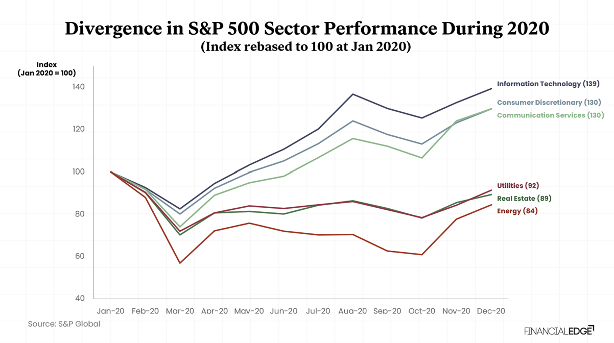
The K-shaped recovery was not only visible in jobs, incomes, and business resilience; it was also clearly reflected in sector-level market performance. Although all major sectors fell during the March 2020 sell-off, their paths diverged sharply over the remainder of the year. Sectors aligned with digital adoption, remote activity, and changing consumption patterns rebounded quickly and finished the year well above their January levels. Others, particularly those tied to physical activity, commercial occupancy, or commodity demand, recovered only partially and remained below their starting point. In this sense, financial markets did not simply reflect the recovery; they also amplified the contrast between the economy’s winners and laggards.
The chart below captures that divergence in market terms. Information Technology, Consumer Discretionary, and Communication Services formed the upper arm of the K, benefiting from structural tailwinds strengthened by the pandemic. Energy, Real Estate, and Utilities formed the lower arm, reflecting sectors that either remained directly exposed to disruption or lagged meaningfully in the rebound. Together, these sector paths provide a clear market-based illustration of how a single shock produced sharply different outcomes across the same economy.
The Upper Arm of the K: Sectors That Pulled Ahead
-
Information Technology (39% increase by December 2020)
Information Technology was the clearest upper-arm sector of 2020. After declining by 18% in March, it recovered faster than any other major sector and continued to rise through the rest of the year, ending 2020 at 139 on a January base of 100. The rapid shift toward remote work, cloud infrastructure, software, semiconductors, and digital services created a strong structural tailwind. Rather than simply recovering from the shock, the sector benefited from demand that was accelerated and, in many cases, durably brought forward.
-
Consumer Discretionary (30% increase by December 2020)
Consumer Discretionary finished the year almost level with Communication Services, ending the year up ~30%. However, that headline performance concealed significant internal divergence. Much of the strength came from e-commerce and large online retailers, supported by households with stable incomes and rising asset values that shifted spending from services to goods. At the same time, restaurants, leisure, and large parts of physical retail remained under pressure.
According to the National Restaurant Association’s 2021 State of the Restaurant Industry Report, restaurant and foodservice sales fell $240bn short of their pre-pandemic forecast of $899bn for the year. By December 2020, more than 110,000 eating and drinking places had closed either temporarily or permanently, and the sector finished the year nearly 2.5 million jobs below its pre-pandemic level.
One sector can therefore contain two very different recovery paths. That is the K-shape working not only across sectors, but also within them.
-
Communication Services (30% increase by December 2020)
Communication Services closely tracked the strength seen in technology, ending 2020 at 130. Businesses linked to streaming, social media, digital advertising, and online communication benefited from a sharp rise in digital engagement during lockdowns. In that sense, this sector did not merely participate in the recovery; parts of it were strengthened by the crisis itself, placing it firmly on the upper arm of the K.
The Lower Arm of the K: Sectors That Lagged Behind
-
Energy (16% down by December 2020)
Energy presents the starkest lower-arm example in the chart. The sector fell by 43% in March, hit by the combined effect of collapsing oil prices and a severe demand shock as travel, transport, and industrial activity slowed abruptly. Although it recovered somewhat over the remainder of the year, it ended 2020 at only 84, 16% below its January level. Unlike the digitally enabled sectors, Energy had little exposure to the structural shifts that supported the upper arm, making it one of the clearest examples of a sector left behind.
-
Real Estate (11% down by December 2020)
Real Estate also remained below its January baseline by year-end, finishing 2020 at 89 despite aggressive monetary easing and the broader recovery in financial markets. The weakness was driven largely by commercial real estate, particularly office and retail properties, where the pandemic raised deeper questions about future demand.
According to Real Capital Analytics, U.S. commercial real estate transaction volume fell 68% in Q2 2020 compared with Q2 2019, the lowest level for a second quarter since the Global Financial Crisis. Broken down by property type, the picture was even sharper: office sales fell 71% and retail sales 73% year over year in that same quarter. More than $32bn worth of hotel and retail real estate became newly distressed in just the first half of 2020.
Residential real estate performed very differently. Pandemic-era stimulus, near-zero interest rates, and a surge in demand from households relocating or upsizing drove residential prices sharply higher. The median value of a U.S. home rose from $139,100 in 2019 to $201,000 in 2022, a 45% increase, according to the Federal Reserve’s 2022 Survey of Consumer Finances.
That divergence, office and retail declining while residential surged, is precisely the K-shape operating within a single sector of the stock market. Investors in a listed real estate index in 2020 were not getting exposure to the housing boom. They were getting the weighted average of that housing strength and the deep structural distress in offices, shopping centers, and hotels.
-
Utilities (8% down by December 2020)
Utilities ended 2020 at 92, making it one of the weakest performers even though it avoided the extreme collapse seen in Energy. As a defensive sector, Utilities did not suffer the same direct shock as more cyclical industries, but it also did not participate meaningfully in the rebound. In a market increasingly driven by growth, technology, and risk appetite, Utilities lagged through relative stagnation rather than acute distress, placing it on the lower arm of the K.
Instructor Tip: When I show this chart the most common mistake is reading it as a story about sectors. It’s actually a story about business models within sectors. Consumer Discretionary was up 30%, but restaurant groups were getting crushed at the same time Amazon was printing records. If you can’t disaggregate performance to the business-model level, you’re going to misread both the risk and the opportunity. Always ask: where inside this sector is the K-split happening?
What This Suggests for Financial Markets
- Sector-based indices can rise even when large parts of the economy remain under pressure
- Sector allocation matters more as returns diverge sharply across business models
Implications for Investment Banking
For investment banks, a K-shaped environment is not just a macro backdrop; it directly affects where deal opportunities arise, how risk should be assessed, and which clients remain active in the market. Deal activity is unlikely to be evenly distributed. It tends to concentrate among large-cap corporates, sponsor-backed firms, and other well-capitalized issuers that still have access to funding and strategic flexibility. These are the clients most likely to continue pursuing acquisitions, equity raises, debt refinancing, and public-market issuance even in more uncertain conditions.
On the other side of the K, opportunities shift rather than disappear. Smaller businesses, highly leveraged companies, and weaker middle-market issuers are typically more exposed to slowing demand, tighter financing conditions, and reduced balance-sheet flexibility. For banks, that often means a rise in restructuring, liability management, recapitalization, and distressed advisory mandates.
In practical terms, banks need to identify early which arm of the K a client or sector sits on, and adjust coverage and execution accordingly. On the stronger arm, the priority is to originate and execute growth-oriented transactions. On the weaker arm, the focus shifts to capital preservation, balance-sheet repair, and restructuring-led advisory. In that sense, recognizing the K-shape is not simply about understanding the economy; it is about allocating coverage, pricing risk correctly, prioritizing opportunities, and aligning product strategy with where demand is actually building.
Instructor Tip: In practice, the K-shape is one of the most useful frameworks for building deal origination instincts. When a client sits on the upper arm, well-capitalized, growing, with strong equity prices, the commercial conversation is about growth: M&A, equity raises, refinancing at scale. When a client is on the lower arm, the conversation shifts entirely: liability management, covenant relief, restructuring deals. The skill isn’t just identifying which arm they’re on. It’s recognizing when a client is transitioning from one arm to the other, and being in the room before the crisis fully arrives.
Policy Responses
Policy can soften a K-shaped downturn, but it does not automatically close the divide. Fiscal support helped cushion the immediate shock during the pandemic, while ultra-loose monetary policy stabilized markets and supported borrowing conditions. But these tools also had uneven effects. Low interest rates and rising asset prices benefited asset owners and large borrowers more than financially constrained households, while later rate hikes weighed more heavily on those already under pressure.
That is why broader stimulus alone is often not enough in a K-shaped economy. More targeted measures, such as industrial policy, infrastructure spending, and skills retraining, are better suited to addressing the structural shifts driving the split.
Instructor Tip:The policy response to a K-shaped economy is one of the hardest things to teach, because the conventional tools tend to work in the wrong direction. Rate cuts and quantitative easing stabilise markets and support asset prices, which helps the upper arm first. Broad fiscal stimulus is blunter: it can reach the lower arm, but only if it’s well-targeted. The real question isn’t what policymakers did, it’s who each tool actually reached, and who it missed. That’s where the K-shape becomes a lens for understanding the limits of macro policy, not just its effects.
Criticisms of the Concept
The K-shaped framework is useful, but it has clear limits:
- It is descriptive, not predictive. Identifying a K-shape after the fact is straightforward. Forecasting its emergence, depth, or resolution is considerably harder. The framework offers diagnostic value but limited forecasting power on its own
- It oversimplifies a complex reality. The binary upper and lower arm framing masks divergence across geography, sectors, and firm size on one hand, and income class, age, skill on the other. Some economists now describe an “E-shaped” economy to capture the fracturing of the middle class as a third distinct layer, neither thriving nor collapsing, but stagnating
Conclusion
The K-shaped economy is not just a metaphor; it is a way of understanding how modern recoveries actually unfold. After a major shock, one part of the economy moves ahead while another remains under pressure. For analysts and finance professionals, that matters because headline indicators can mislead. Large-cap equity indices can stay strong, even hit records, while consumer sentiment weakens and financial stress builds elsewhere.
That is why the K-shape remains a useful analytical framework. It helps explain why markets can look strong while parts of the real economy still feel fragile. It also forces a more important question than whether “the economy” is recovering: who is actually recovering, and who is not?
Refer to the Download section to access the Investment Checklist, a practical tool to assess upper- and lower-arm dynamics across your deal portfolio and pipeline.