


Interactive Data Visualization
September 14, 2022
What is Interactive Data Visualization?
Interactive data visualization is a way to present charts and graphs that give the presenter the freedom to manipulate visuals so they can explore the data themselves. If you want to create visuals that are interactive, it’s necessary to use software that will provide interactive features. Excel does not offer much. It’s necessary to use something like Power BI or Tableau, which are extremely useful for creating interactive visuals and dashboards
Key Learning Points
- Interactive data visualization provides an audience with a way to explore data for themselves, enabling them to discover hidden patterns and trends.
- The software used to create the visuals will determine the type of
- Power BI and Tableau have a great range of interactive tools, while Excel does not.
- Some of the most common ways to add interaction to a dashboard include filters and slicers, hovering with tooltips, and animation
Benefits of Interactive Data Visualization
The main benefit of interactive data visualization is that it offers a user-friendly way to discover patterns and trends in a large and complex dataset without having to understand how to design or change the visuals themselves.
Imagine a manager who wants a report on the current financial status of the organization. You can provide visuals that show the sales and profit over the last 3 years. Perhaps they would like to explore the results on a regional basis. Interaction allows the manager to change the charts so they only show results for one location at a time.
Examples of Interactive Data Visualizations
There are many ways to add interaction to visuals. It will depend on the software being used, but here are some of the most common features typically found in Power BI or Tableau:
-
Slicers and Filters
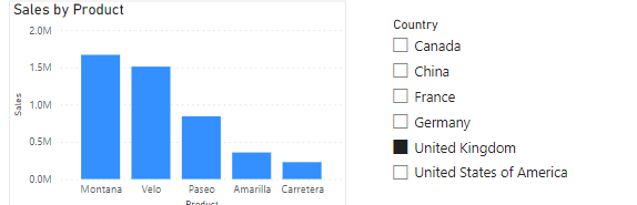
By adding a slicer to a page of a report, you can filter the results on all the visuals so they only use data for the selected item. The example below shows a slicer in Power BI, which changes the Sales by Product chart so that it uses only data from the selected location:
-
Hovering/Tool Tips
When the user hovers the mouse over a data point on a visual, a tooltip will display additional info. The example below shows a tooltip that will display the Product Name, Sales Total, Profit Total, and Units Sold for the Velo product just by hovering the mouse over that column:

-
Animation
Animation is a great way to let users see what is happening to the data over a long period of time. The example below shows a play axis added to the Monthly Sales line chart. When Play is pressed, the line chart moves through each year automatically


How to Create Interactive Visualizations
It will very much depend on the software being used as to how you add interaction to visuals. However, the concepts are similar. If you want to provide additional info on a data point, you would want to create a tooltip. If you need to filter the data to a particular group of values, then look for filters or slicers. Both Power BI and Tableau offer these features.
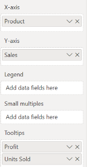
Here is a quick overview of how to add a tooltip to a visual in Power BI:
- Create a bar, column chart, or a pie chart
- Power BI will automatically include any fields used in the visual, so by default,G there should be a tooltip with some basic info when you hover over a bar/column/slice of pie
- Make sure the visual is selected and drag any additional fields you want to use in the tooltip to the tooltip section of the Visualizations Pane. The example below has added Profit and Units Sold:
Access the download for a step-by-step guide to creating interactive visuals using a dataset.
Enroll on our Power BI course, and learn how to use it for storytelling with data through visualizing your data in dashboards.