
Send download link to:
Use Interactive Visuals Download
Recommended Course

Data Visualization
June 17, 2025
What Is Data Visualization?
Data visualization is the practice of representing data in visual formats, such as charts, graphs, and maps, to make complex information more accessible and easier to interpret. It helps uncover patterns, trends, and outliers that might be missed in raw data.
Key Highlights of Data Visualization
- Data visualization converts dense datasets into intuitive visuals.
- Data visualization makes it easier to share insights across teams.
- Visuals help stakeholders quickly grasp key metrics and trends.
- Tools like Power BI allow for dynamic dashboards that update with live data.
Types of Data Visualizations
Common types of data visualizations include:
- Bar/Column Charts – Compare categories or track changes over time
- Pie Charts – Show proportions or composition of a whole
- Line Graphs – Display trends over time
- Scatter Plots – Identify relationships between variables
- Gauge Charts – Show progress toward a goal or target
- KPI Visuals – Compare actual performance against targets
- AI Visuals – Use natural language queries, key influencers, and smart narratives
Data Visualization Examples
There are several ways to utilize tools like Power BI to create interactive visuals from your data. Here are some of the most commonly used features in Power BI or Tableau:
Slicers and Filters
Slicers on the front page of a report allow you to filter the results on all the visuals, meaning they only use data for items selected. Here is an example of a slicer in Power BI, this changes the Sales by Product chart so that it uses only data from the selected location.

Hovering/Tool Tips
Hovering or tool tips allow the user to display additional information when the mouse is hovering over a data point on a visual. This example shows a tooltip that will display the Product Name, Sales Total, Profit Total, and Units Sold for the Velo product just by hovering the mouse over that column.

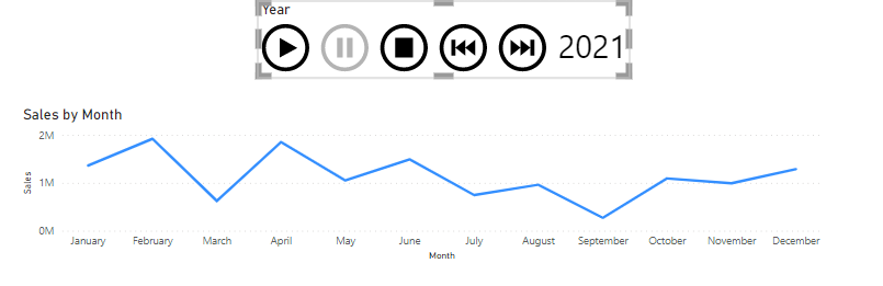
Animation
Animation allows users to visualize what is happening to data over a long period of time. The example below shows a play axis added to the Monthly Sales line chart. When Play is pressed, the line chart moves through each year automatically

Benefits of Data Visualization
The benefits of data visualization include:
- Visuals help us process information more quickly than raw data.
- Data analysis and visualization lead to improved accuracy and reduce the chance of data being misinterpreted.
- User-friendly tools like Power BI and Tableau offer drag-and-drop interfaces.
- AI features like Smart Narratives and Q&A visuals in Power BI enhance interactivity and automation.
Common Data Visualization Use Cases in Finance
Data visualization is valuable across roles and industries. Here are some example use cases:
- Business analysts and managers use data visualization for performance tracking and strategic planning.
- Finance professionals use data visualization to analyze trends in transactions, portfolios, and forecasts.
- Marketing teams use data visualization to visualize campaign performance and customer behavior.
- Educators & trainers use data visualization to simplify complex concepts for learners.
- Anyone working with data, especially in sectors like banking, healthcare, logistics, and tech, can utilize data visualization.
The Best Data Visualization Tools
In November 2024 Forbes ranked the best data visualization tools, here are their findings:
| Tool | Ranking | Links |
| Power BI | Best data visualization software | microsoft.com/en-us/power-platform/products/power-bi |
| Tableau | Best for interactive charts | tableau.com/ |
| Qlik Sense | Best for AI | qlik.com/us/products/qlik-sense |
| Klipfolio | Best for custom dashboards | klipfolio.com/ |
| Looker | Best for visualization options | lookerstudio.google.com/overview |
3 Tips for Effective Data Visualization
- Choose the Right Visual for the Data
Choosing the right chart type for your data is essential. Bar charts are best for comparisons, line graphs for trends, and scatter plots for relationships. Using the wrong visual can obscure insights rather than show them.
- Simplify and Focus Attention
Be clear. Avoid clutter by limiting unnecessary gridlines, 3D effects, or excessive labels. Use color intentionally to highlight key metrics or trends. Using Smart Narratives and Q&A visuals to keep things intuitive and focused.
- Tell a Story with Context
Data alone isn’t enough; context transforms your data into valuable insights. Data is essential to support decision-making, especially in financial contexts, so ensuring your data is useful for this is essential.
Tableau vs Power BI
Both Tableau and Power BI are leading tools for analyzing and visualizing data, offering interactive dashboards and a wide range of chart types. They support connections to various data sources, including Excel.
Tableau
- Offers a free version called Tableau Public.
- Allows online access via browser, though with limited customization.
- A full desktop version is available for a 14-day trial or free for students for a year.
- Free versions store work in the cloud and make it publicly accessible—unsuitable for confidential data.
- Known for its drag-and-drop interface.
- Offers high flexibility in visual design and storytelling.
- Includes a rich library of tutorials and a public gallery of visualizations.
Power BI
- Free desktop version available (not for Mac users).
- Requires an organizational or educational email for account creation.
- Work is private by default; sharing requires a paid Pro license.
- Includes a query editor for data cleansing and transformation.
- Easier for beginners, especially Excel users, due to familiar concepts like pivot tables.
- Offers a broader range of chart types via the Power BI Marketplace.
How to Learn Data Visualization
Discover how data can influence banking decisions with Data Visualization and Power BI, created in partnership with Neueda. The course is designed to help you analyze patterns and trends in financial data using Power BI. It includes:
- Cleanse and prepare financial datasets
- Build dashboards and visuals in Power BI
- Apply best practices in data storytelling and analysis
Discover the best practices and technical requirements for modeling, visualizing, and analyzing data with Power BI. Use an interactive case study to check your understanding of the topic in context.
Conclusion
Data visualization is the practice of presenting data in visual formats like charts and graphs to simplify complex information, enhance communication, and support decision-making. It includes various types, such as bar charts, pie charts, and line graphs, which help in identifying trends and relationships in data. The benefits include faster insight discovery and improved accuracy, making it valuable for business analysts, finance professionals, marketing teams, educators, and anyone working with data across different sectors.
Additional Resources
Bar and Column – Charts in Power BI
Interactive Data Visualization