
Football Field Analysis Template
Send download link to:
Recommended Course
Football Field Analysis
March 13, 2023
Building a football field mechanically can be learnt through practice. But creating a football field that makes business sense to your boss or to a client can be much harder. Here are our key football field analysis tips to ensure your football field meets industry standards.
Key learning points
- Group valuation approaches together – standalone valuations vs. takeover valuations – so it’s easy to see the difference in their values
- Ensure the valuation ranges are not too wide or too narrow.
- Using forecast profits is better for trading comps, and LTM is best for transactions comps and LBO
- Avoid creating value ranges artificially, by taking 5.0% or 10.0% above and below an average value. It’s much better to use actual high and low data points to create the range
- In DCF valuation, the range is most commonly created by flexing the WACC and growth rate input assumptions
- For listed companies, include a 52-week high-low share price range in the football field – it gives a reference point for the other valuation methods
- For takeover valuation methods, (in addition to transaction comps and DCF with synergies ), consider including the premium paid method, as this is useful in times of economic uncertainty, such as a recession
The Football Field
In the football field chart below, we have 7 valuation methods:
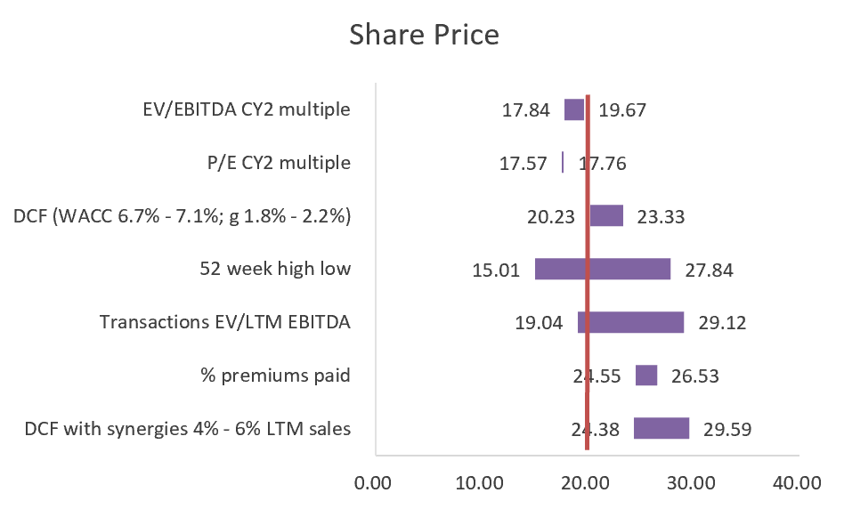
Standalone vs takeover
The first tip is to show the standalone valuations and the takeover valuations separately. The top 4 values on the chart (EV/EBITDA CY2, P/E CY2, DCF, and the 52-week high-low range) show the value of this company as a standalone entity (i.e. as it currently is), whereas the bottom 3 values (transactions, % premium paid and DCF with synergies) are the potential values of the company if it was taken over. We can see that the top 4 techniques give a lower value, whereas the bottom 3 give a higher value. This is because any acquirer of a company in a takeover will have to pay a control premium. This football field shows clearly the takeover values being higher, giving readers confidence that our analysis provides some consistency of valuation across the different methods.
Narrow vs wide
We do not want the horizontal valuation bars to be too narrow or too wide. Imagine you were having your car valued and the dealer said it was worth between $17,000 and $19,000. You might think that’s a reasonable valuation range. However, if the dealer said it is worth between $17,000 and $17,002, that would seem a little too precise, and a valuation between $10,000 and $60,000 would be so wide as to not be helpful. This is where judgment and skill come into play. There are no objectively right or wrong answers, but, in this chart, the second valuation range (P/E CY2) looks too narrow. But how should this be addressed? One option could be to look at another valuation multiple, for example, the P/E CY1 range, to see if it provides a wider, more meaningful, range.
LTM vs forecast
Should valuation multiples use historical numbers (sometimes referred to as last twelve months, or LTM) or forecast future profit values, maybe this year’s expected profit (calendar year 1, or CY1) or next year’s expected profit (calendar year 2, or CY2)? Trading comps and transaction comps could in theory use any of these, so which is best?
For transaction comps, we use LTM because that is the only information we will have available for historical transactions – once a company is acquired its individual profit isn’t reported separately from the rest of the group it is now part of.
In trading comps valuation a lot more data is typically available and, if we have them, the preference is to use the forecast figures. Potential buyers want to value a company based on forecast numbers because if they buy the company (or even just buy 1 share) they will be paid dividends from those future forecast earnings. In choosing between the first or second forecast year, CY1 or CY2, CY1 may be preferred as the forecast is more likely to be accurate, but if the year you are currently in (CY1) is experiencing a shock economic event, such as a global pandemic, then you may want to ignore it and use CY2 which may be more reflective of the company’s value in more normal times.
What’s wrong with creating a distribution around a single data point?
When creating the horizontal value bar, you should ideally not take one data point and build a distribution around it. While it can be handy to find an average valuation or median valuation, and then build a horizontal bar that is 5% higher and lower than the average, this won’t be based in reality. A client could reasonably ask, “Why didn’t you go 6% either side of the average, or 4% either side?”. Instead we prefer to find a high and low value from numbers in the real world, for example for trading comps – find a comparable company with a relatively high multiple for the high end of the range and then get a comparable company with a low multiple for the low end of the range. Then, if needed, you can always point to those comparable companies as evidence to back up your numbers .
DCF – flex the assumptions to get the range
With a DCF valuation model one absolute value will be generated, so to create the value range it is necessary to flex the input assumptions. In the football field chart above, we have flexed the WACC from 6.7% to 7.1% and the long-term growth from 1.8% to 2.2%. But remember, you need to be careful with the size of these input ranges so that the horizontal bar in the football field doesn’t end up too narrow or too wide.
Use the 52-week high-low share price as a reference point
The 52-week high-low bar shows the extreme values that the share price reached in the last twelve months. It is an important reference point for other valuation methods. In our football field chart above, we can see the three standalone valuation techniques (EV/EBITDA CY2, P/E, and DCF) give values that sit within the 52-week high-low-value range, which gives us confidence that the market and our values are in broad agreement. The vertical share price line in red, which shows the current share price, is also close to our standalone values. Conversely, if our standalone values were very different to the 52-week high low and different to the current share price line, we’d need to ensure we could explain why these differences exist. Maybe we feel that the market is not taking into account information that is important in our eyes. Remember, the football field chart doesn’t tell us everything – you must be able to back up your values with reasons.
Premium paid valuation method can be included
For takeover valuation methods, transaction comps and DCF with synergies are often included in football field charts. But the premium paid is also a useful and often overlooked metric. If the transactions comps multiples occurred in normal market conditions in the past, but we are currently in a recession, then those historical multiples are unlikely to be reflective of what might be achieved in recessionary times. Instead, the premium paid on those prior transactions can be a useful alternative and can indicate how much of a premium to the current share price might be acceptable to the selling shareholders, no matter what stage of the economic cycle you’re currently in.
Football Field Valuation Certificate
If you are interested in this topic, look for our Football Field Valuation Certificate which reviews the different valuation methods, prepares valuation ranges for each valuation method, summarizes the valuation ranges and interprets the results.
Conclusion
These industry norms will ensure your football field chart provides your clients with useful information, rather than a random selection of numbers that give them little advice. If you can include all or most of these tips in your chart, you will have created a football field chart that really adds value.