
Model Graph Share Price Line Workout
Send download link to:
Featured Product

Floating Share Price Line
January 14, 2021
What is a Floating Share Price Line?
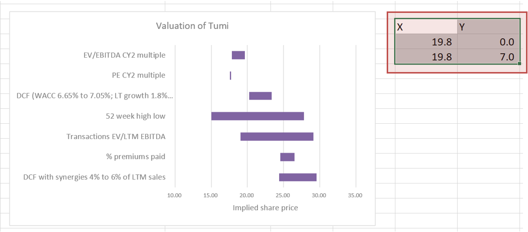
A floating share price line adds a lot of value to the football field. It shows your valuation in context to the current share price and gives perspective on your valuation relative to the market.
But how to add the line to the graph? First, we need a simple football field. You can download our file here.
Next we need to do 2 things:
- Add a new data series
- Change the new data series into a vertical line
1. Add a New Data Series
First, we add a new data series. We need X and Y values.
The X values are the share price. It will give us a line between 2 places, hence we need the number 19.8 written twice.
The Y values could be any two numbers separated by a set interval. We’ve chosen 0.0 and 7.0 as there are 7.0 valuation techniques on our football field, but you could just as easily use 0.0 and 1.0.
Now we need to add the share price to the graph.
NB: it won’t look correct until we’ve finished all the steps! Don’t worry if it looks strange until then.
Right click the chart and click on Select Data

In the dialog box, click Add
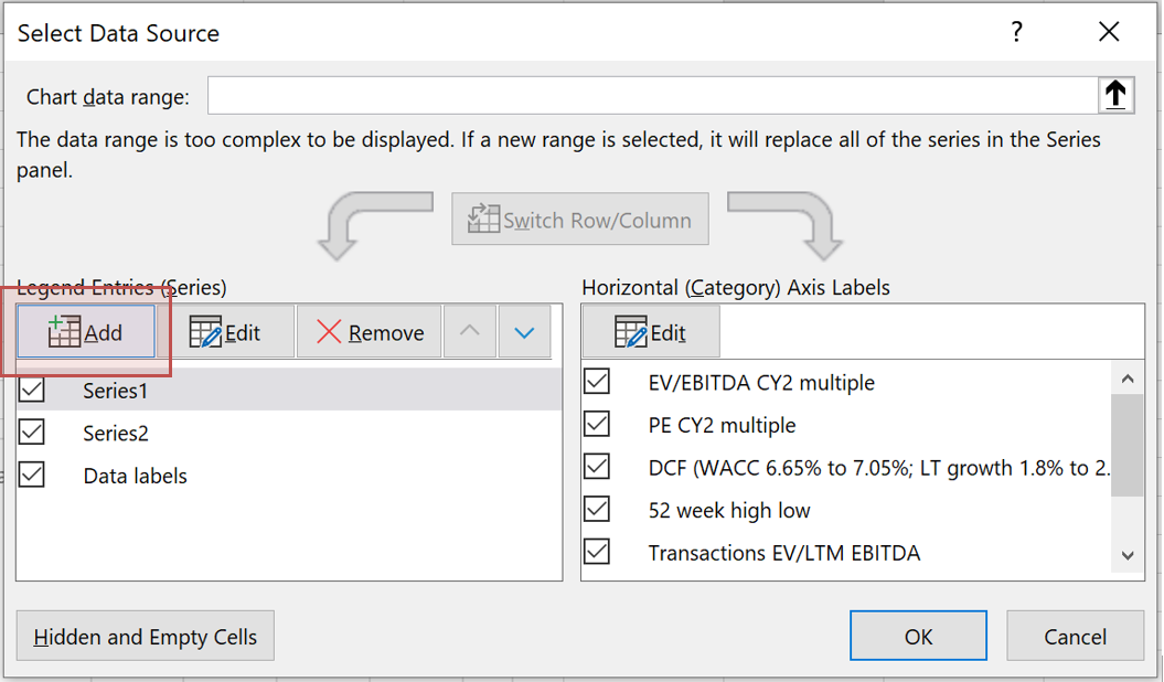
Type in the series name (here it is Share Price) and in the Series Values, select the 19.8 X values we input earlier.
We’ll have to change this later, so we’ll be back to this box soon.
Select OK. Then select OK again.
2. Change the New Data Series into a Vertical Line
The share price has been added to the graph but not as a vertical line (it may look different on your graph).

To change it, right click on one of the bars and select Change Series Chart Type.

Choose the Combo menu on the left, then your new Share Price series name should appear with Stacked Bar (or perhaps Clustered Bar) next to it.
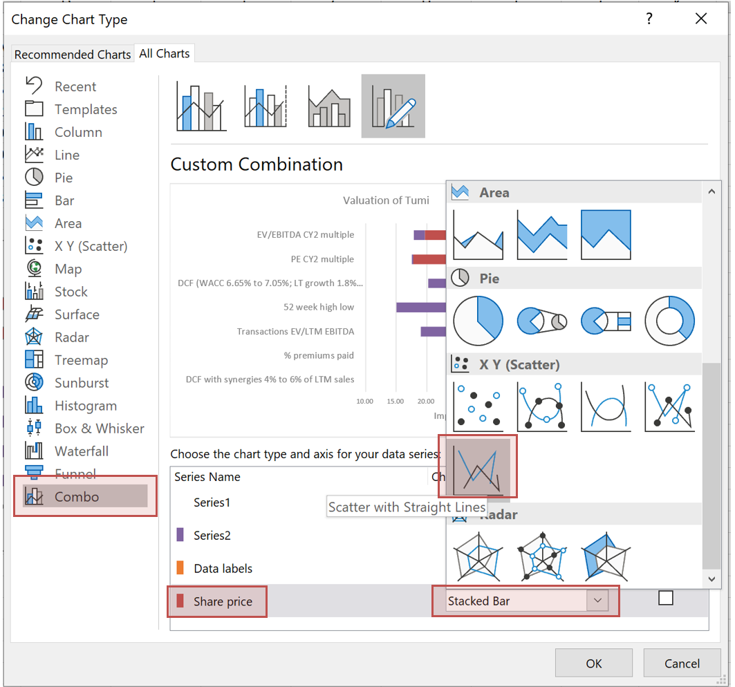
For the Share Price series, click the drop down next to Stacked Bar, scroll down to the X Y (Scatter) group, and click on the picture of the Scatter With Straight Lines graph.
The share price has probably disappeared or looks completely wrong! Excel isn’t clever enough to know what we want it to do. So we need to tell Excel how to display the new line as a vertical line.

Right click the chart and choose Select Data.

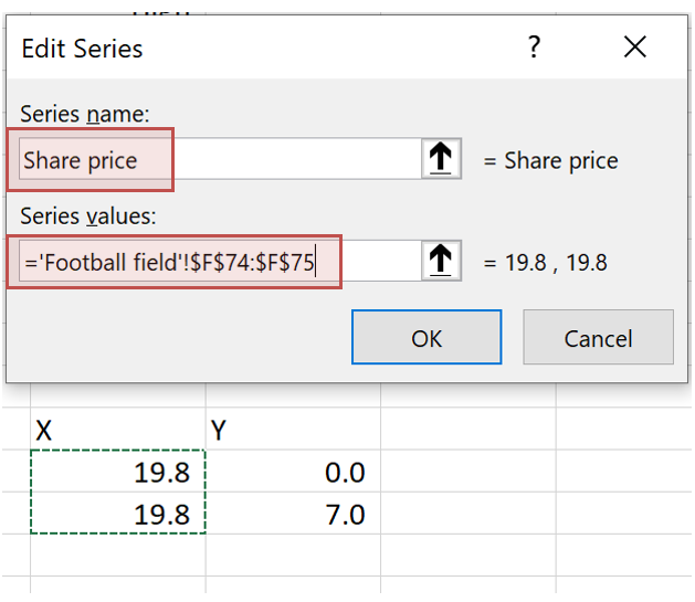
In the dialog box, first click on the Share Price series, then click the Edit button.

We now need to tell Excel the X and Y values (at the moment they will be blank or linking to the wrong cells). For the X values select the 19.8 numbers, and for the Y values select the 0.0 and 7.0.

Click OK, and OK again, and the vertical line has appeared. We are 95.0% there. It probably doesn’t go all the way to the top of the chart though.

To change this, select the secondary axis on the right hand side of the chart and then right click. Click on Format Axis.

A menu opens up to the right-hand side of the screen. Set the minimum and maximum to the numbers set as your Y values, in our case 0.0 and 7.0.
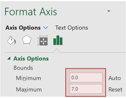
And your floating share price line has now been added.
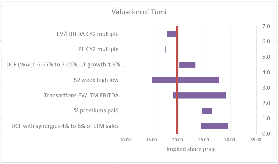
We see that the PE CY2 Multiple valuation implies a value below the current share price, while the % Premiums Paid valuation and the DCF With Synergies valuation both imply valuations significantly above the current share price. You could now change the two X values of 19.8 to whatever you like, even linking those cells to real share prices on information providers such as Factset, Bloomberg, and CapIQ, and the share price line will move!